ID161

Friday, December 9, 2016

unit summary 5

I think technology helps us understand design as an integrated practice by really bringing design components full circle. Technology is everywhere we look in a space whether that be in a more obvious way like a television or led lighting, or simply the fact that a chair is standing and is capable of holding the weight of someone. Since the subject of technology is so broad, I believe scale really goes hand in hand with the concept. Technology can be present in a very small way such as a light. On the other hand, it can be presented in a very large scale such as structural columns supporting a building. Technology definitely relates back to unit 1 about elements and principles. I think of those as the backbone of design and without them, design would be nothing. As for unit 2, as I touched on before, scale and technology are very closely related. Technology would be nothing without the materials that make it up. Woods, plastics, glass, are just some of the hundreds of materials that are present in technology in design. I believe light and color are sort of the icing on the cake for technology. This is more for aesthetic purposes, but is still very important, bringing the space together. Since, technology is in everything we view I believe designs can be described and analyzed by the understanding of technology. Before this unit, I thought of technology only as gadgets like phones and computers. I have realized everything around me from the way my desk is built to the structure of my windows, technology is all around me. 

The coliseum has been talked about alot through the semester. I think it embodies exactly what we've been talking about and really shows technology along with aspects from the other units. The supportive arches add repetition to the space while adding reinforcement to the building. They also used concrete to build this structure which has made it last a very long time. I believe the Romans used a lot of different types of technology in this project without even realizing it.
Posted by Unknown at 4:04 PM No comments:
Email ThisBlogThis!Share to XShare to FacebookShare to Pinterest

Wednesday, December 7, 2016

the 90

The high ceilings in this space makes it very spacious. Not all the furniture matches which adds a laidback tone to the space. Technology is present in the windows, lighting, and furniture. 

This photo shows a lot of different technology. There is tvs that make it easier for the users to see what is being served. There is also a large grill for the Mongolian section and a very interesting lighting but it is actually ventaliation for the grill. 

This photo captures the heat and cooling vents along with structrual poles for the high ceilings. The way they placed them are not only for stability, but aesthetic purposes.

This shows the large fans that keep the room cool and not stuffy, but have a very modern look. We also see structural columns that almost separate the room in half. Since these photos were taken at night, we can really see the fluorescent lighting along with spotlights.

Here is me with the staircase at the entrance of the 90. I think it is very appealing design wise, but also serves the purpose to get to the second floor classrooms.

My expereince at the 90 was very good. I send a lot of time there and now notice all the technology that is incorporated in the space. There is a heavy use of different types of lines and repetition of colors. There is many types of technology as well whether that be simply in windows or more complex in refrigeration and drink machines.

Posted by Unknown at 7:16 PM 1 comment:
Email ThisBlogThis!Share to XShare to FacebookShare to Pinterest

Monday, December 5, 2016

chairs


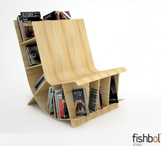
This chair is not only for sitting, but also has an appealing look and is also used for storage in a very unique. I don't know how comfortable this could be, but I think it is a very interesting piece to have in a space. 


This chair was supposed to come with an ottoman. I can see how it could be a little bit more comfortable than it actually is with that attached. It is built very interesting and uses only two materials and screws for security. 


This chair comes with the dorm I live in. It is much more comfortable than you would think due to the small curvature on the back.  It is very light and it is very durable and easy to move around. 


Posted by Unknown at 8:23 PM No comments:
Email ThisBlogThis!Share to XShare to FacebookShare to Pinterest

Friday, December 2, 2016

technology in material

These new technologies that were discussed in the readings prove that technology is always changing and we are heading in a positive direction. Textiles are changing and could become much more useful with smoke dectors built into curtains and weight adjusting pillows. With the combination of the creativity of the designers and the new technological advancements we are discovering,  the interior design profession will definitely evolve. i think using PVC pipe for structural purposes, if not done correctly, could come out poorly and not last as well as the designer anticipated. As for the advanced textiles, there may have to be batteries involved or some sort of energy source which could be expensive for the user and add additional costs. I think these new products are taking away from the traditional creativity of the interior design profession. I feel like sketching will be less common along with handmade products. 
Posted by Unknown at 2:11 PM No comments:
Email ThisBlogThis!Share to XShare to FacebookShare to Pinterest

Tuesday, November 29, 2016

technology in study


There is a lot of technology in my case study, the Sunar Furniture Showroom, that is strutural but also for aesthetic purposes. As far as  I can tell, there is no natural light and the room relies on artificial lighting. There is also many different ttpes of coluns throughout the space, some I can assume for strutural purposes. There is a table also in the room that uses technology to stand up with the standard four leg design. I also was unable to find a picture of my exterior for my case study. 

Posted by Unknown at 9:02 PM No comments:
Email ThisBlogThis!Share to XShare to FacebookShare to Pinterest

Monday, November 28, 2016

technology in light and color

In this day and age, technology is constantly evolving making it easier to complete everyday tasks more cost efficeintly and in a more pleasing way. What really blew me away was the article by Eaton Corporations. I didn't realize there was LED lights could be more energy efficient. I also thought the aesthetics in the hotel were amazing and I couldn't quite imagine getting the same result from just using regualr lights. It was also cool to read for me since Eaton is headquartered 20 minutes away from me and my stepmom is a vice president there. I never quite knew what they did, but now I am a little more educated on the matter. I also thought it was interesting that a company put all their ducting under them. It seems that all these enviromentally conscience inventions are cheaper and more pleasing to the eye. It makes it easier for the designers to create a space with limited complications like the worry of raditors, expensive lighting, etc. 
Posted by Unknown at 8:31 PM No comments:
Email ThisBlogThis!Share to XShare to FacebookShare to Pinterest

Friday, November 18, 2016

technology in time

Technology has been present in all three time periods that we have discussed: anicent, national, and modern. It has been a difficult transition for me to adjust my definiton of technolgy that I once had. To me, when I thought about technology, I thought about computers, cell phones, machines that are manufacturing things or devices and prodcuing products. It was really eye opening for me to hear Patrick talk about all the different types of technology throughout the room that we were in while in pence hall. 
That being said, in ancient times, technology was all around them. The pyramids are still a great example of this. The mud bricks used to build the structures are a part of the technology used in the space. Another example of technology in the egyptians used was the way they created the tombs under ground, along with making fake tombs or "booby traps". Truly, the epyptians were ahead of their time and really set the tone for the upcoming generations. 
As for the national era, the style was very cookie cutter and used renditions that designers adopted from  the French and the English. Columns became very popular which were not only for design purposes but also for structural purposes. In this era, the industrial revolution began to emerge as well. This provided new types of tecnology whether that be with transportation or machinery. Without these new advancements, the modern era would be nothing and the styles would not have changed. 
The modern era introduced many new technologies. I believe this happened due to everyone's creaticvity beginning to emerge. Designers stopped thinking about trends and began to try new things in their pieces. Large windows became very popular which was a new technology. Modernism also was big on different shapes and curvatures. I know egg shell chairs were something very new that people never expected to see. It is interesting to view how things have evolved and changed over the decades. 

Posted by Unknown at 10:02 AM No comments:
Email ThisBlogThis!Share to XShare to FacebookShare to Pinterest

Tuesday, November 15, 2016

technology in scale

I believe cathedrals were super ahead of their times with their detailed structures and large flying buttresses. Most cathedrals were very large and were placed in the center of the city almost as a "home base". The interior details such as stained glass windows and very detailed paintings and sculptures are not only for appeal, but to honor God. These big extravagant buildings were not just for the public eye but to praise jesus. I believe the designs of these cathedrals were so complex compared to other structures that were being built around the same time period. The italians and english, where most of the catholic community lied at that time, were also ahead of the rest of world when it came to technology.
Posted by Unknown at 12:22 PM No comments:
Email ThisBlogThis!Share to XShare to FacebookShare to Pinterest

Monday, November 14, 2016

case study 4


artificial light
muted colors, dark lighting
overall, a drab place
Posted by Unknown at 7:22 PM 1 comment:
Email ThisBlogThis!Share to XShare to FacebookShare to Pinterest

Unit summary 4

Light and color help us understand design as an integrated practice by making what we view more appealling and connecting all aspects of the design together. Without color, life would be so dull and so boring. Similarily, without light, aspects would be completely different and would not have the same effect on the viewers as it normally would. For example, the UK Art Muesum is almost completely reliant on artificial light with spotlights on each of the pieces. Without these spotlights, the pieces would blend into the wall and would seem odd in a gallery space. Light and color can also enhance scale making the structure or object seem smaller or visa versa. For example, the lincoln memorial in Washington, D.C., relies heavily on the use of light. At night spotlights shine down on the statue of Lincoln and also have spotlights shining upwards on the columns on the building. The column spotlights make the building seem very large, even from very far away. The way the lighting is set up on the statue also makes it the obvious focal point. The whole structure is white marble, but no two slabs are the same. Therefore, when examining closely in detail, you can notice the different natural tones throughout.  I also believe that light and color connects back to what we have learned in unit 1 and unit 2. Color and light can change the complete look of scale and can also be described with the design elements and principles. All designs can be described with color and light, even if the object is monochromatic or black and white. Even though the piece may not be vibrant, it can still be full of different hues and shades.  
Posted by Unknown at 8:48 AM No comments:
Email ThisBlogThis!Share to XShare to FacebookShare to Pinterest

Sunday, November 13, 2016

uk art muesum visual essay


Overall, these pieces really blend well together. There is no natural light in the space and strictly relies on all artifiucla lighting. The two used are fluorescent ceiling lights and then spotlights strategically placed to show off the art throughout the museum. The walls are all white, letting the art be the focal point of the space. There are wood floors and and a couple wood benches for viewing. 

Posted by Unknown at 8:01 PM No comments:
Email ThisBlogThis!Share to XShare to FacebookShare to Pinterest

Thursday, November 10, 2016

campus building

The Good Samartian hospital is one of the main attractions not only on UK's campus, but also in the city of Lexington. It is very large and can be viewed at almost any angle. From the outside, the sun makes the red brick pop against the contrasting concrete portions of thAe buildings. As the day goes on and the sun goes down, artificial light comes into play adding emphasis on certain areas and creating hues of darker and lighter shades across the building. As for the inside of the buldings, there are large windows around exits but as you go deeper into the building, it is flooded with artificial lighting. The hallways also come off almost eerie due to the dim hue the lights give us. I believe this is to keep the vibes calm since sometimes the hospital can be a place of high stress. 
Posted by Unknown at 9:09 PM 1 comment:
Email ThisBlogThis!Share to XShare to FacebookShare to Pinterest

Wednesday, November 9, 2016

newman, singletary, savs

There are many similarities and differences between these three spaces when discussing light and color. The newman center is very dark when it comes to color. With no natural light, it creates a sense of eerieness that almost can be turned into relaxation. The artificial light used in the space is warm, making it a comfortable place to come and worship. The lighting in the newman center is similar to those in the singletary center. The lights are warm and the space in the auditorium is kept very dim with limited dark colors. In the lobby of the singletay center, there is many windows that create a brighter space than the actual peerfoming space. The color scheme is still kept bare, yet this time enhanced by the change of the natural light throughout the day. Lastly, the SAVS is the brightest space out of the three. the SAVS also has a limited color scheme, without counting the art of the walls. Skylights in the space cause natural light to peer in making the space overall brighter as the day goes on. This space has the most windows than any of the other spaces, but still relies heavy on artificial light. 
Posted by Unknown at 5:36 AM No comments:
Email ThisBlogThis!Share to XShare to FacebookShare to Pinterest

Friday, November 4, 2016

Albers Squares

Albers squares were a stable piece from the 1950s and inward. No square seemed to be the same, each with some sort of abstract design. there are many different hues throughout the designs, along with ombre concepts. Many of the squares actually contrast one another. While one has bright colors, others have neutral colors. Or perhaps one may be monocromatic while another is polychromatic. Truly, the possibilties are endless and along with Alber's creativity.
Posted by Unknown at 5:52 AM No comments:
Email ThisBlogThis!Share to XShare to FacebookShare to Pinterest

Wednesday, October 26, 2016

unit summary 3

I believe materials help us understand design as an integrated practice by connecting all elements involved in the design through the use of materials. Besides scale, I believe materials is one of the most important parts of any design. It is simple, without materials, the design itself would not exist. All design principles and elements relate back to what material was used in the making of the piece. For example, the coliseum was made with very strong, weather enduring materials which we know based on the piece's longevity. Materials and scale are very much related when discussing designs. I think they depend on one another. Without one of them, the piece would not make sense. The Willis Tower in Chicago, Illnois is a perfect example of scale and material. It is the tallest building in Chicago and is made mostly of glass. It is has a very modern look and is a main focal point for the city. It is also impressive from an experience point of view of how stable the building is when it is mostly made of glass. I fully believe that material links backs to unit 1 and unit 2. It was frustrating for me to study elements and principles and scale without the connection of materials. Materials, to me, make the design. For example, the great wall of china is made with of old brick from centuries ago. Imagine how different it would look if the whole wall was metal or glass. Materials all connect back to the original design elements and principles. As we go unit through unit, I am realizing that everything in design tends to build and rely on each other. I think all designs can be better comprehended through material study. 
Posted by Unknown at 7:35 PM No comments:
Email ThisBlogThis!Share to XShare to FacebookShare to Pinterest

Monday, October 24, 2016

Material sketching


10/23/16


Gatton college of business: S. Limestone
Because of the use of glass from floor to ceiling, it creates a very open space for the inside of the building. It also allows a lot of nautral light into the space. I think the desigers chose this material to try to add soe curb appeal to the buiding since you can see the large glass wall from the main road. It also gives the builiding a more modern look. I believe they were a lot of pressure when builidng this building. They tried to make it as modern and professional as possible. There is many examples of line throughout the space with the conrete detailing and the paneling with the glass windows. Light is also a huge element that is used here since the glass windows are floor to ceiling.

Willy T. Young Library: South/Central campus
The inside environment of Willy T has two main color schemes. One being all white, clean cut marble, while the other is dark wood. I sketched the third floor here where you can see the vastness of the large wooden workspaces along with large tables to do work on, both using the same wood as their main material. I believe the designers chose this dark wood to bring a homey type feel to the library. Also , by repeating the same materials, it makes the large space appear smaller. This very well could not be real wood, but it looks real based on color and texture. The way the panels are placed creates pattern throughout the space along with repetition. You can look down each side and everyone looks exactly the same.


Johnson Center: sports center drive
The Johnson Center is placed kind of away from other main buildings on campus. Its large concrete overhang and dark gray, almost black color, makes it stand out compared to the other buildings on campus. I believe when they builded this, they wanted something different and something that stood out hence, the large detail that holds the title of the building on it. It also extends out the other way, creating emphasis. It also is so large creating a unbalanced scale that is appealing to the eye. 
The 90 lobby: South Campus
The 90 lobby is very modern looking and makes it seem like there are minimal materials used in the space.  I believe when the designer was creating this space he wanted a focal point but for it to still blend with everythig else involved in the space. It also needed to be versatile to get upstairs to the classrooms. With the metal staircase, it creates a modern feel to the space. There is also metal seperating the panes of the glass which ties back in metal from the staircase. You can also find it as the "grout" on the tile floor creating lines.


Posted by Unknown at 5:41 AM 1 comment:
Email ThisBlogThis!Share to XShare to FacebookShare to Pinterest

Friday, October 21, 2016

21st century

For whatever reason, my videos will not load so I did some other research trying to come up with some answers. A new material that is used in the 21st century is plexiglass. This is a strong material that adds a sleekness to the space and gives the space an overall modern feel. Another very popular material, is plastic. It is used at this point in almost everything we know today. In the upcoming decade I believe a stronger more durable plastic may be built in order to create larger things like buildings.
Posted by Unknown at 5:27 AM No comments:
Email ThisBlogThis!Share to XShare to FacebookShare to Pinterest

Tuesday, October 18, 2016

metal + glass

The flatiron buiilding in the heart of New York City is a prime example of the new modern style of glass and metal. Along with the repeated pattern of windows and metal detailing, the building itself is a odd shape compared to every other building in the city. I believe when it was built it very much ahead of it's time and is a frequent spot for tourists, even today. 


Posted by Unknown at 9:36 PM No comments:
Email ThisBlogThis!Share to XShare to FacebookShare to Pinterest

Sunday, October 16, 2016

Metals

Metal is best used for structural purposes, mostly underneath walls and interiors and is usually hidden. Since metal is so strong it is a perfect material to hold up a large structure such as the expansion of the dome on the capitol building. Metal structures were also used when the white house went under renovation from the inside out. The most popular metals are iron and steel when using them for sturdiness. Applications have changed through time but not by much. Today, metals are still used for structural purporses but sometimes are exposed in designs rather than hidden to create a more rustic look. 
Posted by Unknown at 9:34 PM No comments:
Email ThisBlogThis!Share to XShare to FacebookShare to Pinterest

Tuesday, October 11, 2016

coliseum

Limestone and concrete were the two main materials used in the making of the coliseum. These both were used for stability and longevity. The limestone was meant to show power to the people and almost show a sense of a special occasion since "fun" events took place in the center of hte colisuem and everyone came to see them. The sturcture of the building also represented power by the way the different tiers were built. The emperor and his senate sat near the front while the knights and freeman followed behind them. Lastly, the women and slaves sat top tier since they were lowest socially. I dont believe human comfort was thought of when building the coliseum. It was more meant for size and fitting as many possible spectators in as possible regardless comfort. The only comfort thing I saw addressed was the covers that would be rolled out to sheild spectators from sun and rain.
Posted by Unknown at 10:25 PM No comments:
Email ThisBlogThis!Share to XShare to FacebookShare to Pinterest

Friday, October 7, 2016

Young Library

main entrance toward rose street: this entrance has symmetry and a very monochromatic color scheme. There is minmal decroations and textures which add to the aesthetic. 

central space in front of circulation desk: The color scheme is carried on into the main area. There is also similarity throughout due to the windows and the archways. Not seen in this photo, that theme carries all the way to the ceiling. 

Floor 2 Rotunda: This room also has symmetry from almost any angle since it's a perfect circle. The high ceiling also adds to the setting making everything around it seem much smaller including desks, bookshelves, and people.

Reference desk on the 2nd floor: This room differs from the rest with its patterned carpet and painted walls. The woodwork from the rotunda is carried into this room with the entire desk and the bookshelves. The lights are also the same in the rotunda which creates a sense of unity.

Bookshelves: The bookshelves are identical no matter what floor you are on. Most bookshelves, at the least the ones I've observed, are mostly encyclopedias. The collections are the same color which makes the booksheves seem organized and appealing. 

Study carrel: The wood theme is still carried throughout, but this time in the furniture. The round table is the focal point of the room and also adds unity to the room. The lamps on the desk add form to the room while also having a purpose.

Study Room: The study room has different carpet  and different furniture than what we've seen so far. There is also a white board for problems and such. I believe these rooms are kept to a bare minimum when speaking pf design to cause less distractions to those trying to study.

I spend a lot of time in Willy T and I think it is one of the most beautiful pieces of architecture I have seen. I think the high ceilings and the crisp white color scheme makes is so aesthetically pleasing and I enjoy going there to study. Each floor is a little different than the other but they still correlate so well and make the building flow together overall.


Posted by Unknown at 1:50 PM No comments:
Email ThisBlogThis!Share to XShare to FacebookShare to Pinterest

Tuesday, October 4, 2016

Unit Summary 2 (scale)

This unit made me understand how important scale is when trying to understand design. Scale is just as important in design as elements and principles. I recall our first discussion group meeting when we went outside Willy T and examined its vastness. The entirety of the building is huge making it out of scale compared to everything else on campus. On the other hand, some of the windows and railings on the faux balconies are so small compared to every other design aspect on the building making those elements seem out of place. I have become much more aware of scale throughout campus and in my everyday life. I also posted on my blog a photo of the Sydney Opera House which I had the oppurtunity to actually see this summer. It is so large even when you're on a very large water ferry. It also sits at the edge of the harbor making it's light posts, railings, and patrons surrounding it seem very small in comparison. I do believe there is a link between scale and elements and principles. When discussing scale throughout blogposts and discussion groups, I noticed always linking back to the elements and principles of design. I almost feel that scale can be in those categories and should get just as much attention as the other design aspects, specifically, contrast, form, unity, balance, and emphasis. I do believe all designs can be described with scale and it actually is almost necessary to do so. Size can say much about the design, its practicality, purpose, appeal, etc. 

Posted by Unknown at 8:05 PM No comments:
Email ThisBlogThis!Share to XShare to FacebookShare to Pinterest

Monday, October 3, 2016

Case Study 2


The image I chose to recreate shows off a very large centerpiece along with very large columns. Everything in the Sunar Furniture Showroom is a very smooth texture, while the centerpiece has 3-D texture. The large columns immediatly draw your eye to the center of the room and split it down the middle due to the symmetry of the 2 to 1 pattern. They are also very large for the room, making their scale much larger compared to the furniture in the room. 
Posted by Unknown at 6:58 PM No comments:
Email ThisBlogThis!Share to XShare to FacebookShare to Pinterest

chair experience


Paimio Scroll Chair
Alvar Aalto
line, color, form, shape, balance, symmetry, proportion, harmony, emphasis, unity


Posted by Unknown at 4:32 AM 1 comment:
Email ThisBlogThis!Share to XShare to FacebookShare to Pinterest

modern chairs


Modern can mean many different things. Truthfullly, if I learned anything from class, its that the designer chooses what is modern by the way they have designed the chair or other pieces. Most of the chairs in class focused on the elements and principles like color, line, shape, and form. My sense of scale has changed in this unit by realizing that again, the designer is in complete control of the size ofthe chair. For example, there was one very small chair, and then the purple womb was much larger. There was also one with a very tall back that seemed out of place. It all depends on the look and practicality the designer was going for.
Posted by Unknown at 4:14 AM No comments:
Email ThisBlogThis!Share to XShare to FacebookShare to Pinterest

Wednesday, September 28, 2016

multiple modernisms


  • Discussions
  • Grades
  • People
  • Pages
  • Files
  • Syllabus
  • Outcomes
  • Quizzes
  • Modules
  • Conferences
  • Collaborations
  • Chat


The website seems to focus on four aspects of design throughout: nature, people, material, and symbols. It seems to me that modernism is centered around these four things. Personally, I believe modernism is any type of new, fresh design. It doesn't have to coordinate with other buildings or pieces that are considered "modern". I believe any designer that is using original creativity and new ideas can be considered going in the direction of modernism. Even if these ideas do not fully correspond with one another, it is still considered modernism or multiple modernisms. Wright was very into the prairie styel and long horizontal lines in his pieces. Lecorbusier also incorporated many long lines in his pieces, connecting the two together, even though their original styles are very different overall. 

Modern Furniture : Italy Designs
These chairs are not an ordinary design, therefore can be considered modern. These chairs remind of an egg like shape, the roundess is unordinary. 


Posted by Unknown at 8:44 PM 1 comment:
Email ThisBlogThis!Share to XShare to FacebookShare to Pinterest
Newer Posts Older Posts Home
Subscribe to: Posts (Atom)

About Me

Unknown
View my complete profile

Blog Archive

  • ▼  2016 (43)
    • ▼  December (4)
      • unit summary 5
      • the 90
      • chairs
      • technology in material
    • ►  November (10)
      • technology in study
      • technology in light and color
      • technology in time
      • technology in scale
      • case study 4
      • Unit summary 4
      • uk art muesum visual essay
      • campus building
      • newman, singletary, savs
      • Albers Squares
    • ►  October (11)
      • unit summary 3
      • Material sketching
      • 21st century
      • metal + glass
      • Metals
      • coliseum
      • Young Library
      • Unit Summary 2 (scale)
      • Case Study 2
      • chair experience
      • modern chairs
    • ►  September (15)
      • multiple modernisms
    • ►  August (3)
Travel theme. Powered by Blogger.